5th October – Start filming the chorus
6th October – Finishing filming the chorus
12th October – Start filming the verses
13th October – Finish filming the verses
15th October – Start editing the clips together
22nd October – Hand in draft copy
30th September - 22nd October - Create CD cover and band Website
Wednesday 29 September 2010
Friday 24 September 2010
Risk Assesment
Rain – Damage to the equipment like camera and tripod. May also ruin the filming locations such as the grassy field.
Protection: Film in dry conditions and make the best we can during the time. If rain is unavoidable, shelter the equipment with an umbrella.
Pedestrians – Be in the way of shots.
Protection: Make sure the area is clear and kept clear during the filming.
Hazards in the Grass – Hurt the actors when filming the grass scenes as hard or sharp objects may be hidden.
Protection: Check the area thoroughly before filming.
Tripping Over Wires – Someone may trip over the wires that will be coming from the microphone when the actor is singing.
Protection: Wrap the wire up so that it is smaller and not obstructing the floor. Warn people of the potential hazard.
We have very few risks as most of the filming will be done in out of the way places. This will keep us away from potential hazards and allow us the best chances to do what it is we are each location for.
Required Items List
This is a list showing all of the props, items and actors that we will require throughout the entire project.
Filming Equipment
-Video Camera
-Tripod
-Blank Tape
-Digital Camera
Props
-Mobile Phone
-Paper Note Pad
-Microphone
Actors
-2 Male
-1 Female
Costumes
-Male 01: Jeans, t-shirt and hooded jumper
-Male 02: Jeans, t-shirt (light coloured)
-Female: Jeans/leggings, t-shirt, hooded jumper
Computer Software
-Adobe Photoshop
-Adobe Dreamweaver
-Sony Vegas
Locations
-Empty Classroom
-Grassy Field
-Pavement/Path
-Females Bedroom
Mock Website

The layout is similar to the Sum 41 site that I analysed. I liked the general layout of the site as it looked nice and everything was easy to find. I also thought that the columned style navigation bar would be nice on a lined paper effect background.
The photo slider idea was taken from Pendulum's site as it is a good way of showing who the band are, especially useful for Canterbury as they are trying to get their name out there.
The store box on the bottom right is a mixture between Sum 41's and Pendulum's. It will contain a mini navigation bar that flicks between music and merchandise like pendulums, but the photos will show the item in use.
The central column is the same idea that is used on the Sum 41 site. It will contain news about the band, tour dates and upcoming events, as well as links to videos of the band and other related articles. This would be the main part of the site and so needs to be detailed and well laid out so users understand how to use it fully.
Wednesday 22 September 2010
Mock CD Case
Below is our mock-up of what we want our CD cover to look like. We decided that we wanted to go with the idea that we are going to use in the video that gives it a hand drawn look and feel. Therefore, we won’t use photos for the cover, and draw everything using Adobe Photoshop. This will give it a good effect that would make it stand out on a shelf and the bright colours we will use should help catch the audience’s eye. It also fits in with the light style of music that the band creates.

This is the outside cover of what the case would look like. The left is the flap that folds inside to cover the actual CD. The middle area where the track listings are will be the very back and the right with the band and EP name will be the front. All of this will be drawn using Photoshop to create a nice style. On the back panel is the main character that will be in the video, except he will be drawn rather than photographed. He will be facing away from the audience as though he is looking out across the sky. This fits in with the feel of Diver, which we will be making the video for.

This is the inside cover of the CD. The centre is where the disc will be held, hence the different art style and surrounding brick wall effect to separate it from the rest of the picture. The right is the inside of the flap and contains the information about who produced the record, when and where, as well as a special thanks message that the band would have written. The left panel is blank but contains a reference to the song: Diver. One of the lyrics is "I'm on fire, when I'm in the sky", and the picture has a small figure in the sky which is on fire. This small detail is important as it shows that there are links between the art and the songs.
Tuesday 21 September 2010
Storyboards
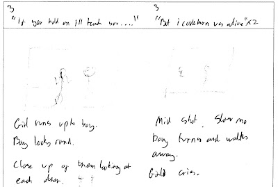
Below is our complete storyboard. Please click on each picture to get an enlarged view.
As can be seen, most of the song has been covered as to what we shall do, and the chorus parts will use the same footage so we only made a storyboard for the two versus, chorus and the extension to a chorus.
Obviously, whilst filming our ideas might change or we may get new ones so the final version won’t look exactly like this, but it is a rough idea that will still be seen in the final edit.


Friday 17 September 2010
Website Analysis

This is the website for the band: Pendulum. The main colour scheme is a mix of blues to create an underwater, deep sea style feeling. It looks quite dark and sinister which fits well with the drum and base music that they make.
The site is laid out in a 3 column style, similar to the Sum 41 site. However, there is a large area above the main site that contains adverts for Pendulum products. This makes it seem as though the band are more bothered about making money than interacting with their fans, as the first thing we see when we enter the site is the logo, and a large advert trying to get us to buy more of their stuff. This box that the advert is in changes every so often, revealing new adverts. Occasionally a list of tour dates comes up but this is not as frequent as the amount of adverts.
As well as the adverts, there is a music player at the top of the site. However, there are only 1 minute clips of songs rather than the full version. This is another way that the band are trying to make money as they are previewing only the best parts of their songs to try. This would entice listeners into buying the full versions.
Beneath the adverts is the main navigation page. The links contained are: Home, Updates, Live, Photos, The Other Side, Videos, Pendulum, Extras and Store. Each of these links are pretty good as they contain most of the things that the users may need. However, some things are missing, such as an FAQ page. A couple of the links could also have been merged together, such as Updates and Live as they contain very similar information.
The left column of the main area contains similar things. It contains photos and videos, as well as the login area for site members. This is good as it makes a more engaging area that is all together so users don’t need to search around for photos or videos.
The right column contains the money making links, such as the store and the dates of tour shows. This is again very neat as all similar links are placed together, making it easy to find what you are looking for.
The central column is a sort of blog, that contains links to reviews of the bands songs, CDs and shows that is updated every so often with more information. It is pretty basic and could use more band interaction as it gives the idea that they don’t have much input as to what happens and it is just a way for them to try and push more sales.
Along the bottom of the columned area are links to Pendulum on different social networking sites, such as Facebook, Twitter and MySpace. This is useful as users can easily see what other sites the band are on and may be able to connect with them there.
Overall I think the site is laid out well, but lacking in band input and seems very commercial which I don’t believe a band should do.
Website Analysis

This is the official website for Sum 41. As can be seen, there are a lot of things on the home page which all lead off onto other things. The main colour scheme for the site seems to be black with blue and red text which fits into their style of punk music.
The site is laid out in a 3 column style, with the main navigation going down the left of the page, information links on the right side and news and videos straight down the centre. This creates a nice neat layout that makes it rather easy to find what you are looking for.
At the top of the page is a photo of the band playing at a very busy gig. The photo is an action shot as you can see the members are mid jump and part way through a song. This gives an example of what their gigs are like. This is helped by the numerous videos embedded in the middle column which show off the bands abilities. Underneath the photo is a music player which contains a number of Sum 41 hits. Users can pause the music and skip the track and the design is very clean and simple. This further shows users what the band are like as the music automatically plays when the page is loaded.
The left column containing the main navigation is well laid out and contains all of the general links to other pages of the site. The main links are: Home, News, Blog, Tour, Videos, Photos, Discography, Q&A, Mobile, Extras, Community and Store. These categories contain all possible thinks that a user may want, so if a user wants to find out when a gig is, they click on tours, or if they want to know some facts about the band they can go on Q&A.
Below the navigation area is a community area in which the users can visit the social websites for the band, such as facebook, myspace and twitter. This area also shows the latest fans to sign up to the site.
The right column contains the closest tour dates making it easy for people to find out when and when Sum 41 are playing. It also contains a link to the store that contains a picture of a fan in a Sum 41 T Shirt.
The central column contains a link to latest Sum 41 videos and the latest news is also shown here. At the top of the column is a blog area where a few blog posts are displayed showing what the band are up to..
Analysis of Album Art

Above is the Arctic Monkeys album art for the album – Favourite Worst Nightmare.
This art is just a photo of a block of houses that has been edited using some sort of software. The windows have all been edited on the central house. They now show a lot of colour and arty patterns which creates a contrast against the dark greys and blues of the rest of the picture. This represents the deep, dark tones of the lyrics in the songs but light hearted way in which they are sung. The font for the name of the band is also bright and contrasting to the majority of the picture. Because the name is hidden away in the corner of the screen, it is as though the band are not really bothered about becoming famous as it isnt slap bang in the middle or large.

Above is the Enter Shikari album art for the EP – We Can Breath in Space, They Just Don’t Want Us to Escape.
This art is quite intelligent, as it is a slightly paradoy of the painting of god reaching out to manking. The stars in the background also add to the idea of god, almost suggesting that he is out there. It could also be the opposite of this idea, and that it is alien life, not god. This is more believable because of the dark theme to alot of Enter Shikari music. The logo for the band is straight in the middle of the art, which gives the impression that there name is what will sell the CD. However, the name is quite small and hard to see but this is probably because it helps it to fit in wth the artwork. The font used for the name is what Enter Shikari use for all of there logos, which keeps the continuity for their work.

Above is the Linkin Park album art for the album – Hybrid Theory
The art is very urban, with lots of graffiti in a Banksy sort of style. This is due to the butterfly wings on the soldier, making fun of what it stands for. The messy stlye of the art is similar to the style of the music that they play, in the sense that the songs are a clash of punk, rock, metal and hip hop. The name of the album and band are also done in a similar way to the artwork, looking as though they have been spray painted onto a wall. This fits in well with the art but also helps promote the band as the name is large and takes up a good portion of the cover. The colour is very lacking in this cover, and it is mostly shades of grey that are used. This creats an urban look and feel which I think is quite nice.

Above is the Gorillaz album art for the album – G-Sides
The art is very cartoony which fits perfectly with their style of music and the image they portray. The art shows the characters that are supposed to make up the band and so the album is trying to be sold based on the band. This is done because the Gorillaz are easily recongniseable and it is therefore easier to use their image than name to sell the album. The art is very Asian in design and could come from somewhere such as Japan or China. The colours used are also very bright and vibrant, which helps grab the audience attention, as well as linking in to the cartoony image of the band.

Above is the Calvin Harris album art for the album – Ready for the Weekend
The art is showing Calvin Harris’ signature “fly eye” sunglasses. This catches the attention easily and also helps to show that it is his album. The use of desaturation helps to make the album standout as the contrast created on the girls face against the background is eye catching. The way his name is shown sideways is also quite eyecatching as it is unusual. The font that has been used is Calvin Harris' signature font that is used for his logos. This helps create continuity amongst his work.

Above is the Jamie T album art for the album – Kings & Queens
The art is extremely eye catching and vibrant due to the colours and strange perspective that the photo is taken at. It is as though the audience is in a hole looking up at the two people and the surrounding buildings. As Jamie T is relatively unknown, the strange but brilliant artwork helps to sell his music as it gives and idea of what he sounds like, which is indie hip hop. The colours are very well chosen, as the orange walls contrast brilliantly against the black and orange in the rest of the art. The way the album name and artist name are displayed is also good. It flows round the main art in a circle, repeating itself. This helps to get across Jamie T's name as he is a relatively unknown artist.
Tuesday 14 September 2010
Audience Questonaire
Ash and I created a questionaire to find out more about our potential audience.
We asked 10 people aged 17 the questions are below are the results.
1) Did you like the track (We played our chosen song to them before this question)?
-Yes: 8
-No: 2
2)Would you listen to the bands other songs after hearing Diver?
-Yes: 7
-No: 3
3)Do you often listen to this genre/type of music?
-Often: 6
-Occasionally: 3
-Rarely: 1
4)What mood does the song give off?
-Happy: 4
-Sad: 3
-Mixed: 3
5)What should the mood of the video be for the song?
-Happy: 3
-Sad: 3
-Mixed: 6
6)What do you think the song is about based on the lyrics (We showed them a sheet with lyrics on)?
-A relationship breakup (love): 5
-A relationship breakup (friendship): 2
-A death: 2
-Other: 1
As our results show, the general idea is that the song is about a male and female's relationship ending, and that it is shown in both a sad and happy way. The audience mostly agreed that they would want to listen to more of the bands music, as well as being fans of the genre.
This is good as it shows us that our audience agreed with what Ash and I believed the song to be about and so the video that we create should be suitable.
Sunday 12 September 2010
Treatment
I have decided that I want my music video to seem as though it as been drawn. I will scan a copy of a piece of lined paper and draw boxes on it. Each box will contain a different part of the video and as the song plays; the video will sort of zoom out from the paper, and pan across to the next box before it zooms in again to show the next clip. Each box will contain a portion of the music, such as: 1st verse, chorus, 2nd verse, and chorus. I will also experiment with different filter effects for the video to create a hand drawn look. This will hopefully go well with the paper style background. However, altering the effects may make it hard to watch the video and so this idea could be scrapped in favour of unedited clips. Overall, I want the video to seem like a photo album. I believe that the song is talking about the singers past where he has recently had something bad happen. I am assuming that he has split up with his girlfriend and is trying to get away from the bad memories and feelings, hence the line “I’ll keep you in mind when I run”.
The actual video recording will show a band playing and singing during the chorus and a flashback sequence during the two versus. This will help enhance the idea that the video is a virtual photo album as it will show what has happened in the past. The flash backs will have a filter on them to make them slightly brighter and vibrant, making it clear that it is a flashback. The chorus where the band will be filmed will mostly just be the singer as it is meant to be a story about him. Therefore, the other band members, (drummer, guitar and bass) will only appear in brief clips, such as the drum heavy quiet parts in the intro instrumental.
Subscribe to:
Posts (Atom)